The moment you notice outcomes slipping (and can’t prove why)
You get a Slack ping: “Conversion is down.” Or support says, “Relevance feels worse.” You open the usual dashboard and the main accuracy number is either missing (labels aren’t in yet) or it looks unchanged. Meanwhile, the product is taking real damage, and you can’t point to a clean cause.
In production, that gap is normal. Outcomes move for reasons that have nothing to do with the model—traffic shifts, a pricing test launches, a new user cohort shows up. If you treat every dip like a model failure, you’ll burn time and trust.
The practical job is to separate “this happens every week” from “something broke,” using signals you can see before labels land.
Is this a real accuracy drop or just normal weekly noise?
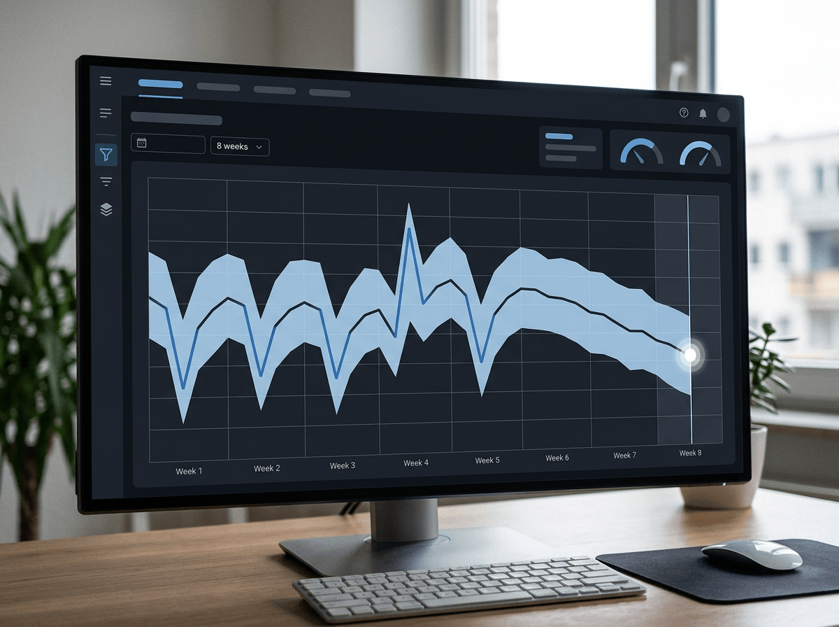
Those “this happens every week” swings usually look like a small dip after a weekend, a bump after an email send, or a slow slide during a holiday. If you don’t lock down what “normal” looks like, every one of those patterns can read like a model problem.
Start by picking a baseline window that matches your product’s rhythm—often 6–8 weeks—and track the same metric at the same cadence (daily, weekly) with the same filters. Then quantify noise, not vibes: keep the median and a simple band like the 10th–90th percentile of recent weeks. If this week lands inside that band, treat it as background unless it persists. If it breaks out for two consecutive periods, that’s a different story.
The catch is seasonality changes. A new promo or feature launch can reset “normal,” so you’ll need to tag those dates or you’ll chase ghosts.
Labels show up late—so what do you watch in the meantime?
That’s why the first few days after a dip feel like working blind: the labels you trust won’t show up until the week closes, a chargeback clears, or a human review queue catches up. Waiting is expensive, so you need a small set of “early warning” checks that correlate with failure, even if they don’t prove it.
Start with input and score behavior. Track feature coverage (missing rates, “unknown” bucket share), key distribution shifts (like new vs returning users), and the model score histogram (mean, percentiles, and the share above your action threshold). If your top-10% scores suddenly look like last week’s middle, something changed. Pair that with a stable canary set: a fixed slice you can label quickly, like a daily sample sent to human review or a subset with fast outcomes.
The limitation: proxy metrics create false alarms. A pricing test can move score distributions without the model getting worse, so use proxies to trigger investigation, not to declare a retrain.
When the data mix shifts, accuracy can ‘drop’ without the model changing

That same pricing test can also make your measured accuracy look worse even if the model didn’t change. The simplest way this happens is a mix shift: you suddenly get more hard cases, more new users, more edge geos, or more long-tail queries. Your overall number drops because the traffic got tougher, not because the model forgot how to predict.
To tell the difference, stop comparing “this week vs last week” in aggregate. Compare like with like. Keep a fixed evaluation cohort (a “frozen” sample you can label over time), and also track performance by a few stable bins like new vs returning, device, geo, and a difficulty proxy (for example, low vs high model score or head vs tail queries). If the bins stay flat but the overall drops, the mix likely shifted.
The real cost: setting up reliable bins and a frozen cohort takes time, and some slices will be too small to read quickly—until one of them quietly fails anyway.
The overall metric looks fine, but one segment is quietly failing
That “quietly fails anyway” part is what gets teams: the overall metric stays in its normal band, but one slice is sliding fast enough to hurt the product. You see it when support tickets cluster in one geo, or when new users stop converting while returning users look fine. If you only watch the blended line, you won’t catch it until outcomes lag, because the healthy majority hides the problem.
Pick a small set of slices that map to real experiences: new vs returning, top geos, device, and one “hard case” bucket (like low-score or long-tail queries). Track the same proxy checks there too—missing features, score percentiles, and threshold pass rate. Then add a simple “segment share” chart. If a slice shrinks, its accuracy can fall without moving the total.
The hard part is volume. Small segments swing wildly, so require a minimum count before paging and keep the rest as “watch” until it repeats.
What’s ‘big enough’ to page someone—versus ‘watch it’—versus retrain?
That minimum-count rule is where teams usually stall: someone wants a crisp trigger, but the slices you care about can be sparse and noisy. So define actions first, then back into thresholds. “Watch it” is for a single-period break that could be randomness: the slice is above your minimum n, one proxy shifts, and nothing else corroborates it. Log it, tag the likely external changes (promo, pricing, traffic source), and require a repeat in the next period.
“Page someone” is for a break that is both big and believable. Examples: two consecutive periods outside your normal band, or one period with a large shift plus a concrete mechanism (feature coverage drops, score distribution collapses, threshold pass rate halves) and it shows up in more than one slice. If it’s only one tiny geo with 40 events, don’t page; sample more or expand the bin.
Retrain only after you’ve ruled out a pipeline issue and a mix shift, and the degraded slice persists long enough to matter—often multiple label cycles. Otherwise you’ll retrain on a transient blip and ship the wrong fix.
A monitoring setup that ends in decisions, not dashboards
That “ship the wrong fix” outcome usually comes from a setup that collects signals but never forces a call. Make your monitoring run on a short loop: every period, produce three lines—overall, your few key slices, and your canary—each with (1) a labeled metric when it’s available and (2) two proxies you trust (feature coverage and threshold pass rate are often enough). Put the baseline band right on the chart and show the event count so no one argues about tiny samples.
Then hard-code the decision: watch = one break, page = repeat or multi-signal break, retrain = persistent labeled drop after you’ve checked pipeline and mix. The constraint is process overhead: if this takes more than 10 minutes per cycle, it won’t happen, so automate the report and keep the slice list short.